

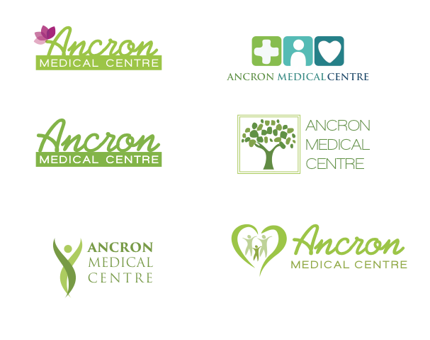
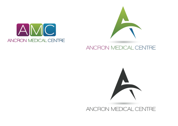
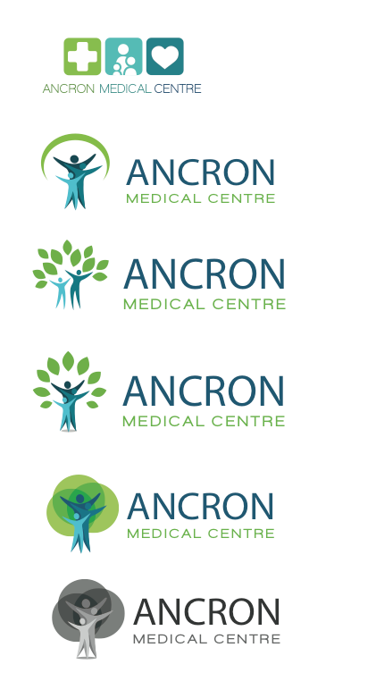
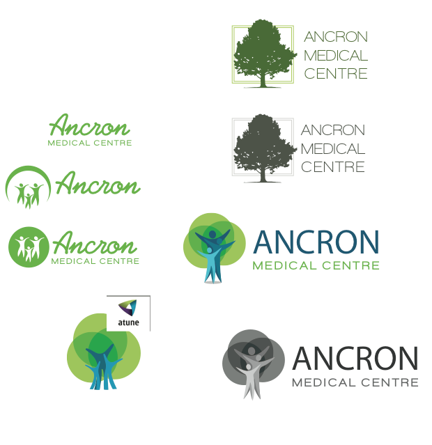
The goal of this logo was to come up with a design that is iconic, welcoming, bright, and friendly. Natural colours and organic lines juxtaposed with the structure of a medical cross symbol were used to represent both “natural” and western approaches to medicine. The variety of colours, while referencing the natural colours found in our local environment, also speak to the diversity and depth of services that the Ancron Medical Centre has to offer our local community. Hey it only took 33 designs to get there but we got it!
Coming up with a logo that both encompasses an organization’s personality and values while connecting with a target audience in a meaningful way is not always easy. Sometimes it takes a while to sort through what doesn’t work in order to see what does.
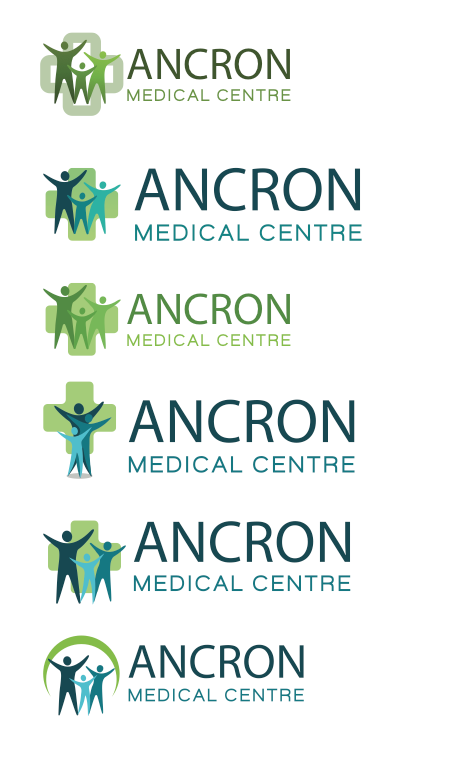
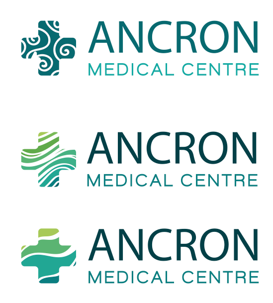
Here are some that didn’t work:

But this one did 🙂
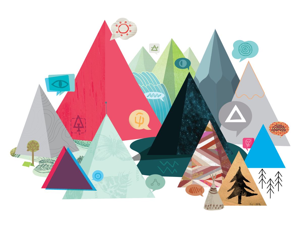
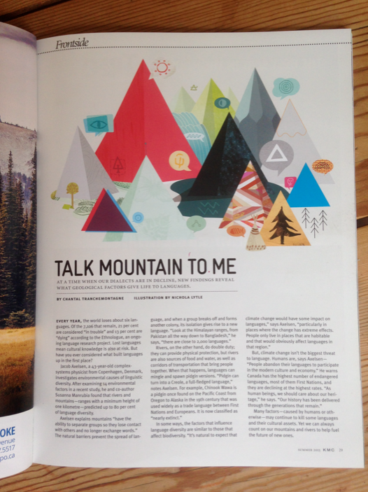
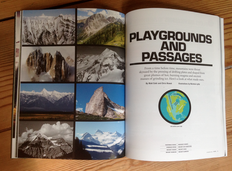
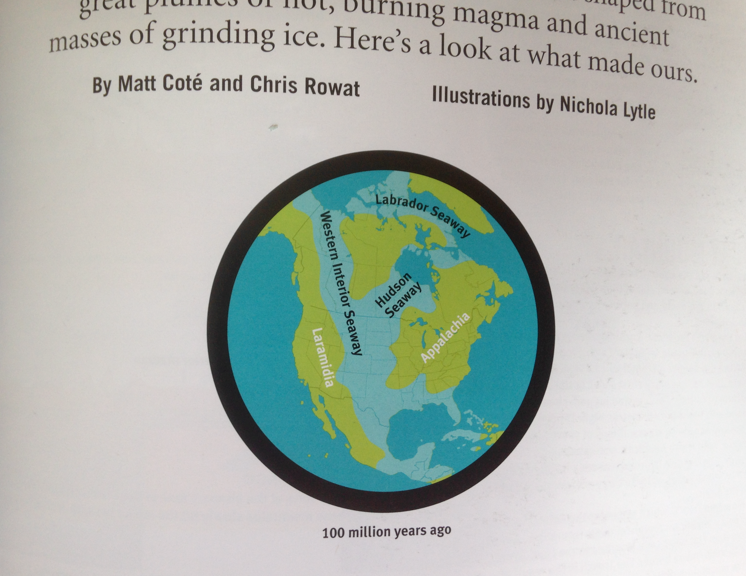
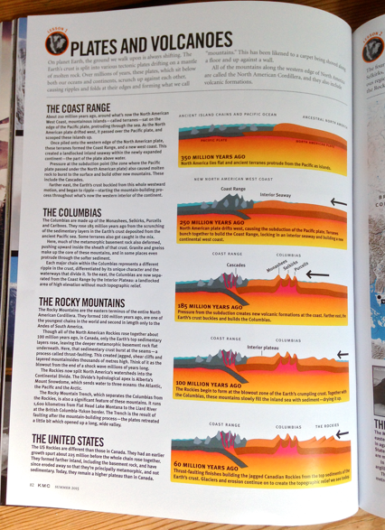
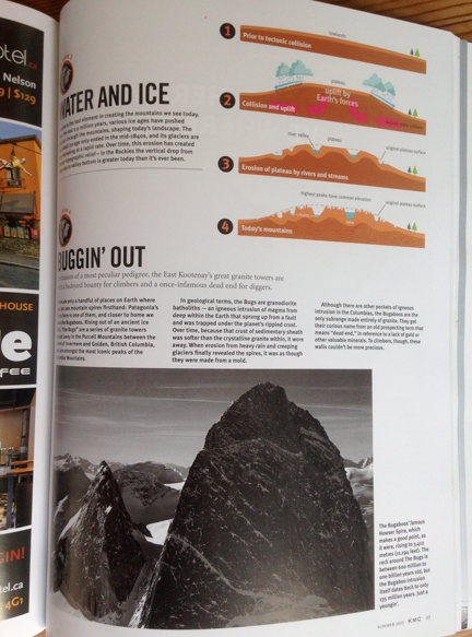
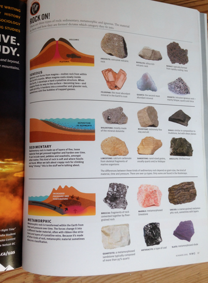
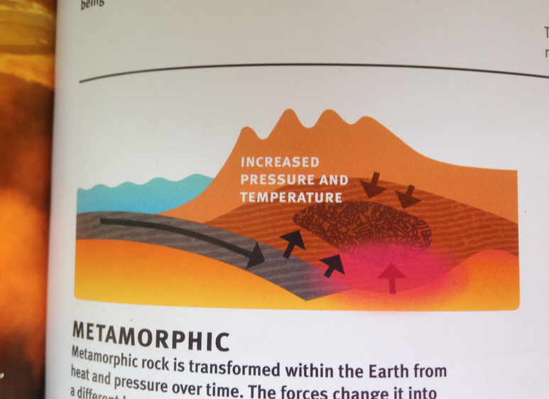
Editorial Illustration Assignment for Kootenay Mountain Culture Magazine – Talk Mountain To Me !
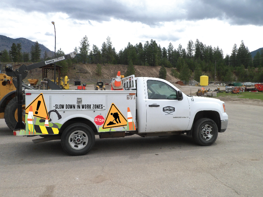
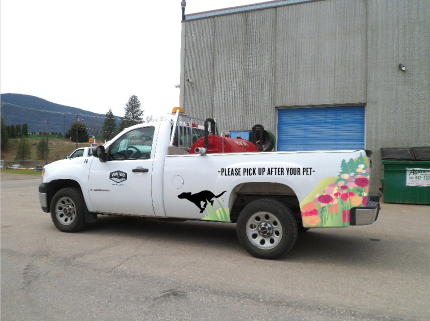
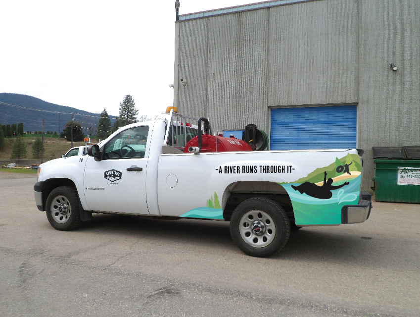
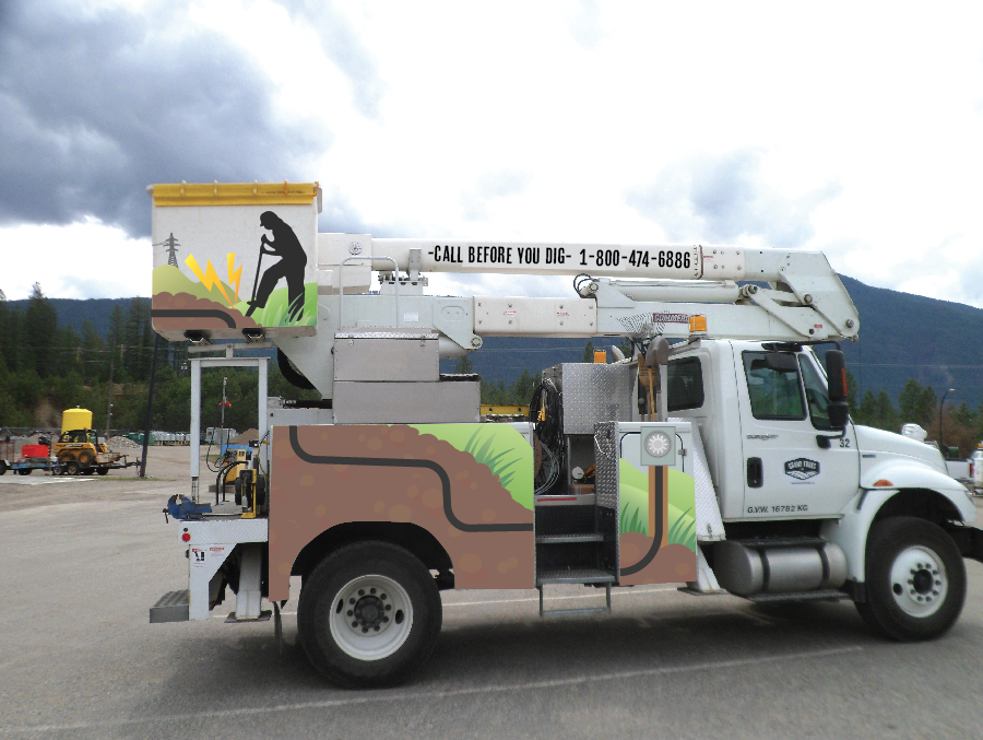
This is the first round of drafts for the City of Grand Forks vehicle wraps… next round will follow with creating vehicle die lines and mapping out all sides of each vehicle. FUN project 🙂
Logo design and marketing for the City of Nelson…


New logo design for our 20th Blueliner’s Icebreaker Tournament
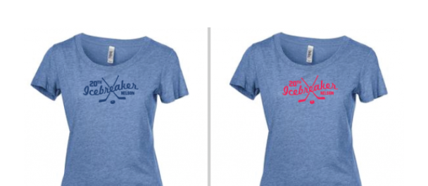
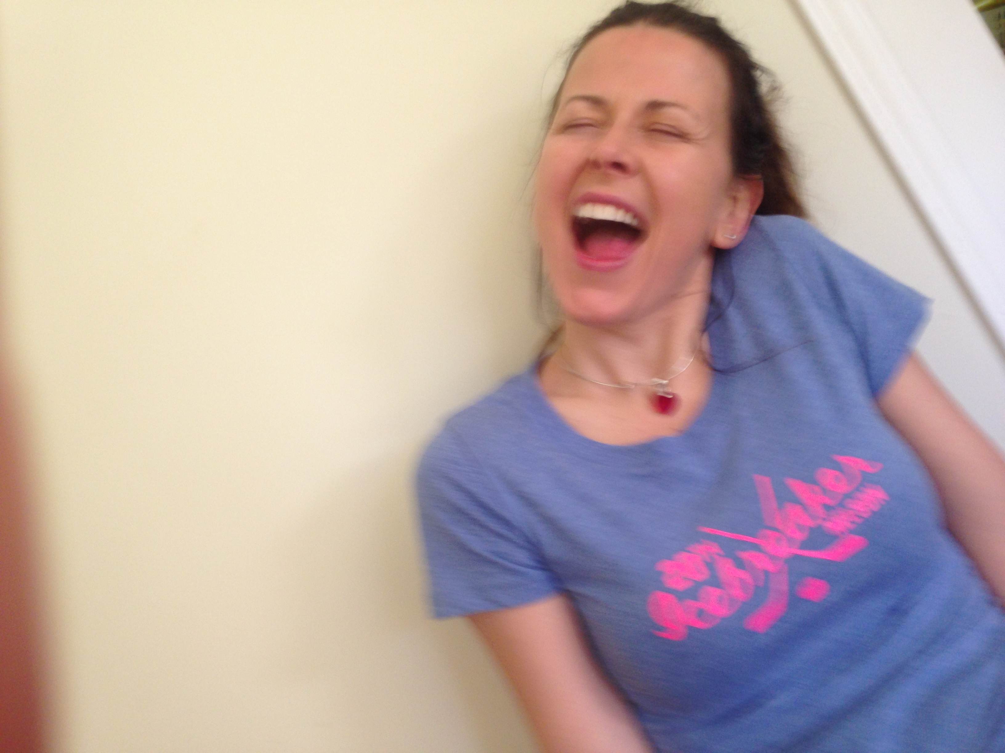
A few t-shirt mockups – our colours are blue but I couldn’t resist the pink
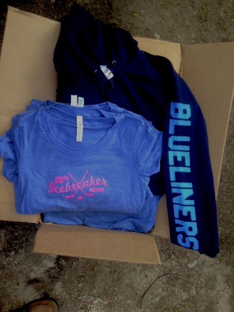
Our team clothing arrives just in time – printed perfectly (and locally) by Nelson’s Big Cranium Design
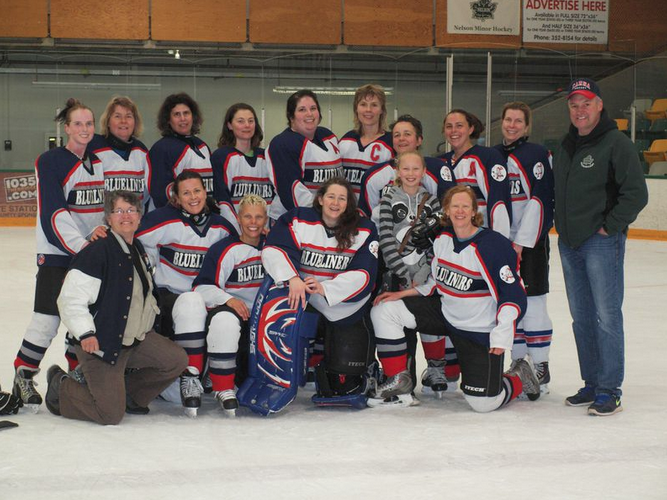
Game 5 in 2 days – winning last game of our season – Yay our side!

More info here
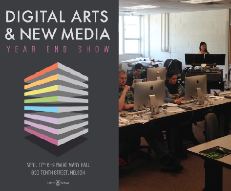
The Selkirk College Digital Arts and New Media Year End Show is next friday.
Join us for a night of fun, creativity, innovation and inspiration!
Students in the program will be showcasing their year’s best works in print, web, photography, digital design, film, motion graphics and 3-D. There will be lots to see.
The date is Friday April 17th 6-9pm at Mary Hall, Selkirk College 10th st campus – admission is FREE
Hope to see you there!
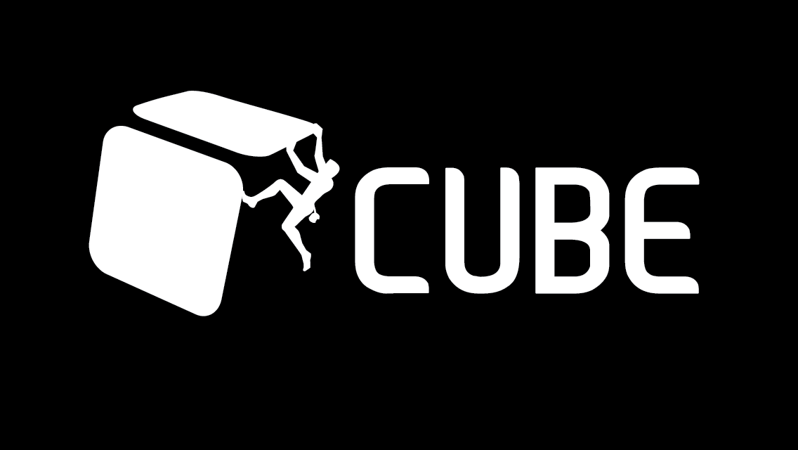
New logo for Nelson’s Community funded Climbing Gym. Opening in the New Year!
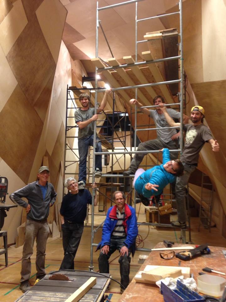
all photos by Scott Jeffery
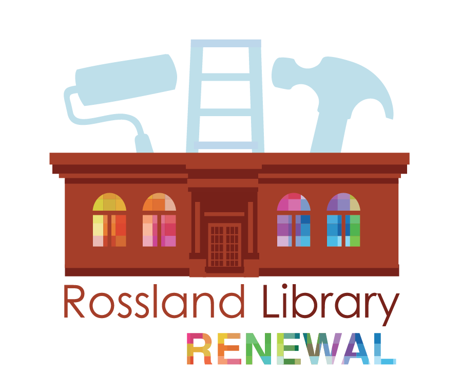
Rossland Public Library is launching a library renewal program to make their library even more fabulous! This logo will be used on web, print and PR promotions to help them reach their community goals.
